Westfield Insurance has been protecting what matters most since 1848. They built a multi-billion dollar regional footprint on a simple premise: financial stability, competitive rates, and actually showing up for people when life happens.
We weren’t brought in to change any of that. We were brought in to give it a digital system that could keep up, with a refreshed brand language that works across business, home, auto, and farm coverage for every digital experience.
Taking a Trusted Brand Somewhere New.
Westfield already had the recognition. The reputation. The iconic sunburst logo. Our job was to help all of it work harder in a world where more and more brand experiences happen on a screen.
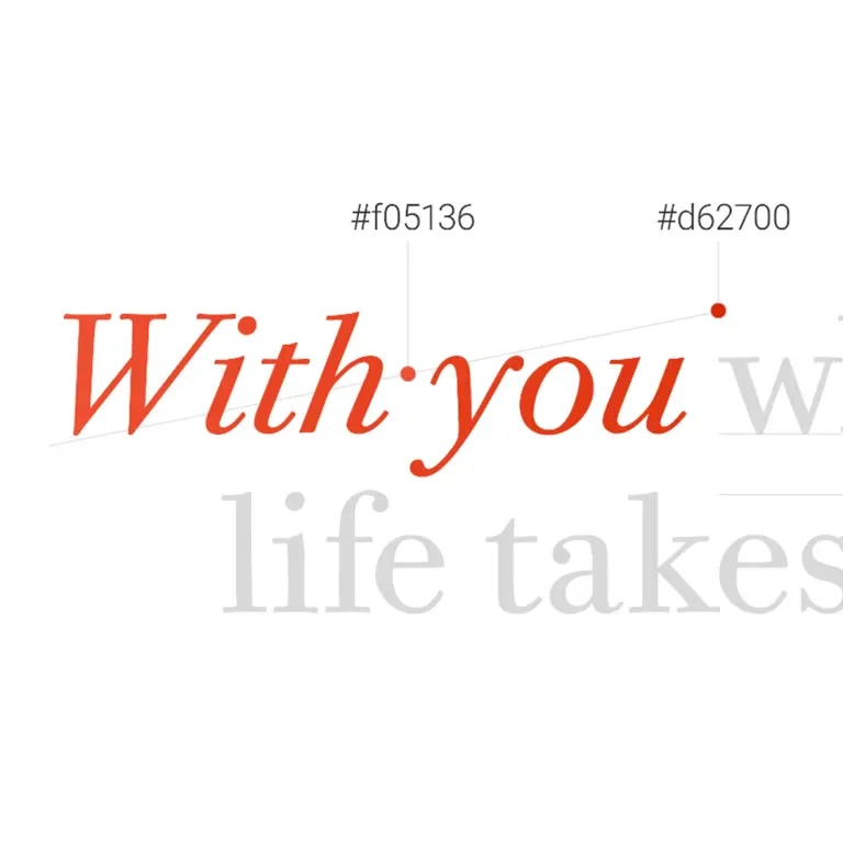
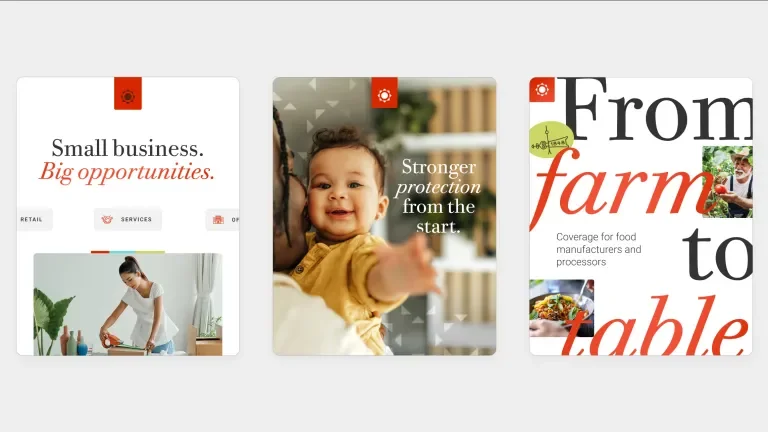
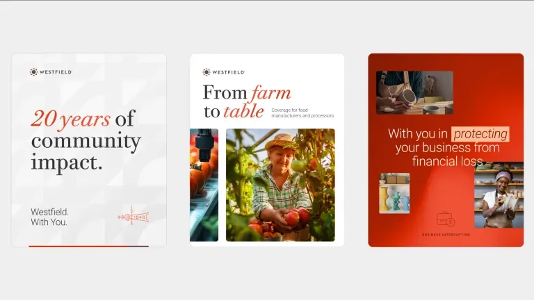
We translated the existing identity into a responsive digital language that feels authentic to Westfield while giving the brand more flexibility, expression and polish. The result: an experience that feels established without feeling static. Familiar, but modern and forward-looking.
Good Design. Down to the Details.
A digital brand has to do more than look good in a few polished examples. It has to keep working — across pages, products, teams, devices and thousands of little interactions.
So we built a modular UI system that gave Westfield consistency without boxing the brand in.
- Color that works harder.
We evolved primary and accent palettes to meet WCAG accessibility standards while preserving the warmth and confidence of the Westfield brand. - Type made for screens.
Clear typographic scales brought hierarchy and readability to everything from major headlines to the smallest policy details. - Components made to flex.
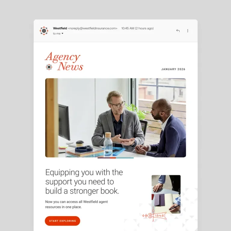
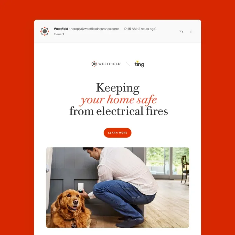
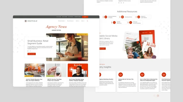
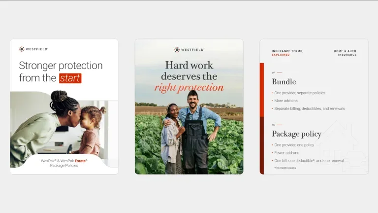
Reusable cards, hero treatments, content modules and interface elements created a common visual language across personal, commercial and agricultural insurance.
A System is Only Useful if People Can Use it.
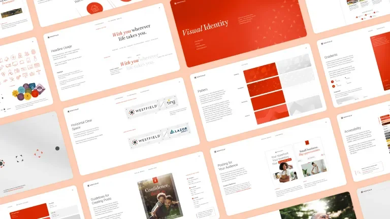
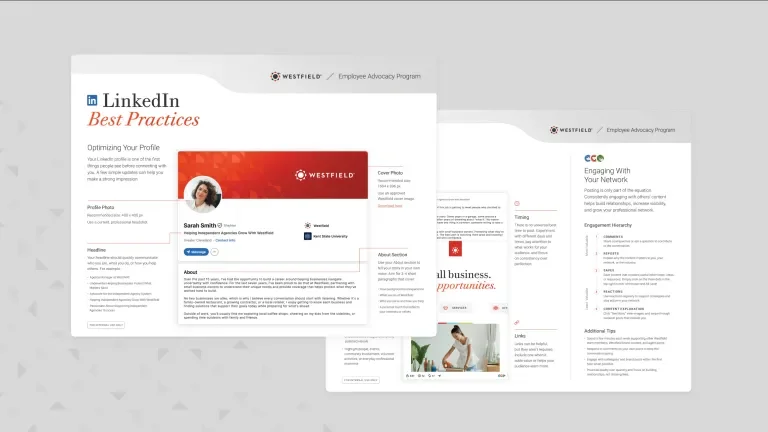
A design system becomes much more valuable when everyone knows how to use it. We brought the thinking together in a comprehensive Digital Brand & Interaction Guide — giving Westfield teams a practical resource for creating new experiences without reinventing the rules every time.
It covered the details that make the difference: responsive logo behavior, interaction patterns, accessible color use, typography, imagery, interface components and a flexible 12-column grid.
Not a brand book meant to sit on a shelf. A working system built to keep the brand moving.
More Consistency. Less Friction.
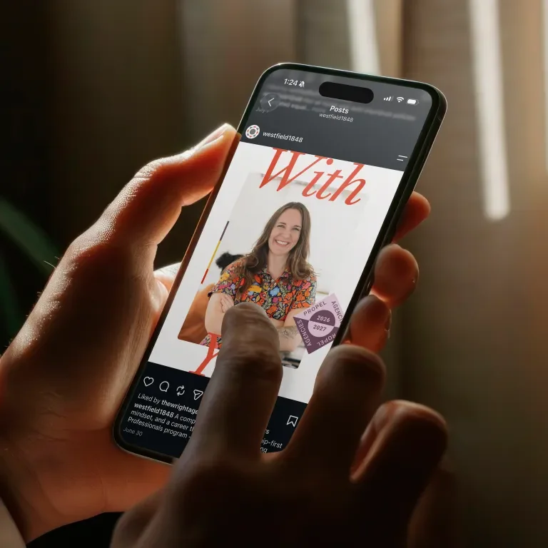
The real test of a system is what happens when you start using it. Across commercial, home, farm and auto, the new visual language gave Westfield a more cohesive way to create digital experiences — from marketing pages and product content to claims, account access, and policy tools.
Everything feels more connected. Easier to navigate. More intentionally curated. And because the foundation is modular, the system can continue evolving right alongside the business.
The Brand Endures. The Experience Evolves.
Modernizing a legacy brand doesn’t mean leaving its history behind. In Westfield’s case, that history is part of the advantage.
By pairing nearly two centuries of brand equity with a flexible, screen-first design system, we helped Westfield carry what people already trust into a digital experience designed for where the business — and its customers — are headed next.