Wayfinding helps people get clear on who they are, where they're going, and how they want to show up. It was time for the brand to do the same.
Most leadership coaching lands in one of two camps: programs built around optimization and performance, or AI-driven tools that can't see the person behind the prompt. Wayfinding doesn't fit either one. It's an executive coaching, leadership, and personal development practice built for whole-person alignment and growth, not just the promise of leadership success. Its Guides are experienced, enthusiastic, and deeply invested. People can engage in whatever way fits them: one-on-one coaching, leadership team experiences, wilderness retreats, community events, or self-guided resources.
Founder Darci Williams had already built something special: a deeply human approach grounded in honesty, connection, and a genuine belief in people. What Wayfinding didn't need was for us to swoop in and invent a whole new brand. It needed clarity.
We helped bring the pieces into alignment. We sharpened the strategy, put language around what made the approach different, and built an identity that finally felt as warm, thoughtful, and energized as the experience itself.
Basically, we got to do for Wayfinding what Wayfinding does for its clients: see what's already there, make sense of it, and help it move forward.
First, We Got Our Bearings.
Before deciding how Wayfinding should look, we dug into what it stood for. There was already a lot to work with: a strong philosophy, a growing range of offerings, and a very clear sense of how people should feel along the way. Our job was to connect the dots.
At the center of the strategy was a simple purpose: help people find their way. We defined Wayfinding's role as Your Guide and organized the experience around three ideas: Clarity, Alignment, and Momentum. That gave the brand a foundation that could stretch from one-on-one coaching to leadership experiences, retreats, events, and self-guided resources.
We also clarified the values behind the work: Honesty, Kindness, Tenacity, Fun, Inclusion, and Excellence. Nothing forced, faked, or made to feel corporate and stodgy. Just a clearer way to say what Wayfinding had been doing all along.
We Didn't Find a Voice.
We Followed One.
Wayfinding already had a voice. It was Darci's. Spend five minutes with her and you'll get it: she's warm, she's clear, and she's endlessly encouraging. She knows when to push and when to give someone room, and people leave the conversation feeling more like themselves. The brand didn't need a new voice. It needed hers on the page.
So we built Wayfinding's voice around the three qualities that make Darci, Darci:
Warm & Approachable. Real and human, never clinical or corporate. It's the kind of language that makes people lean in, not brace themselves.
Clear & Steady. Direct without being cold. It says the honest thing plainly and stays grounded when the road gets uncertain.
Energized & Encouraging. It believes in people out loud. It's optimistic and forward-moving without tipping into motivational-poster territory.
The result is a voice that can talk about meaningful things without sounding heavy, and stay smart without sounding academic. That's what a conversation with Darci feels like, too.
In other words: less keynote, more conversation.
The Brand Got Its Trail Legs.
The work was always about movement. The identity needed to feel like it.
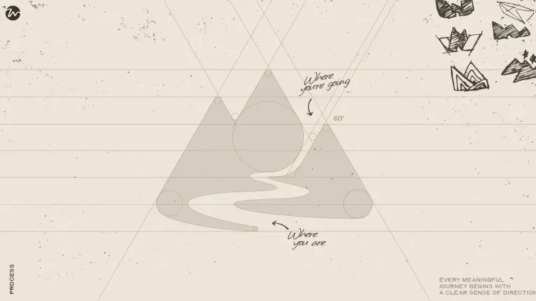
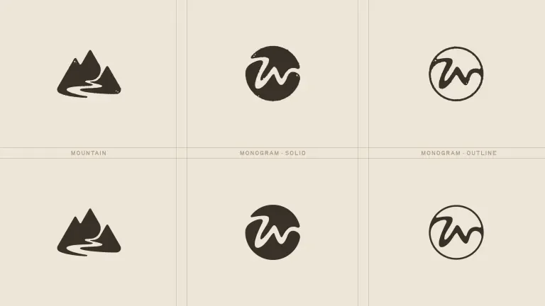
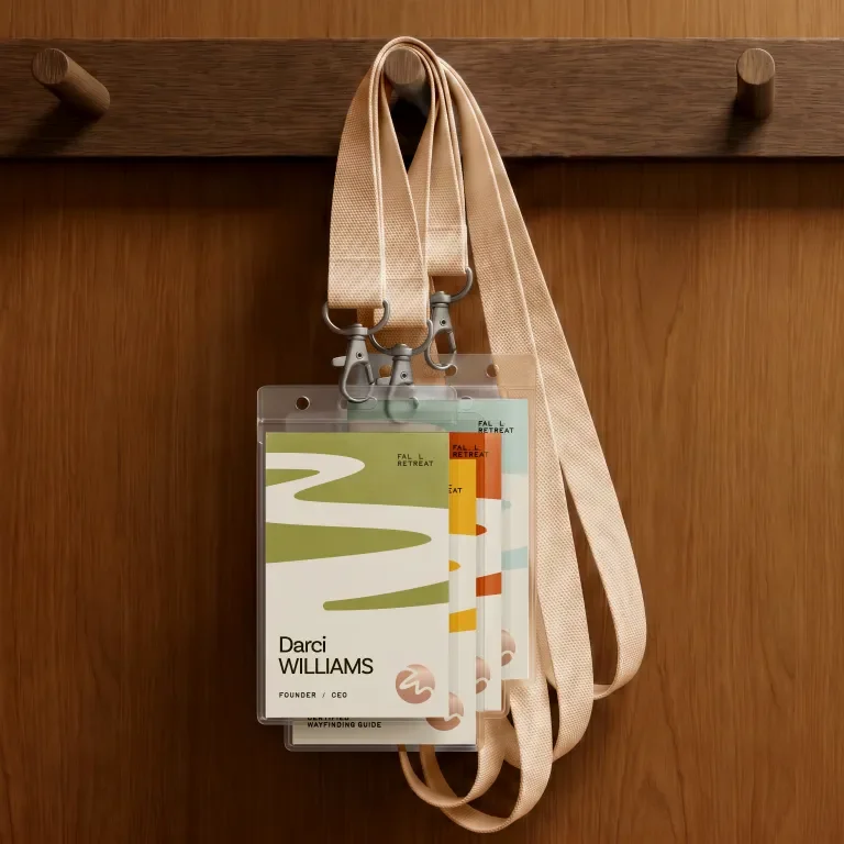
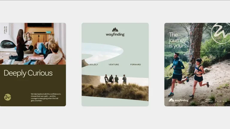
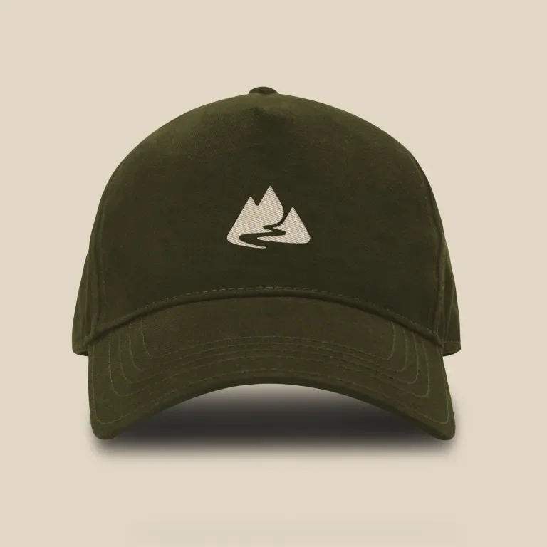
It starts with the path. In the primary mark, a winding trail cuts through a mountainscape, a simple illustration of the journey every leader takes. Ups. Downs. Always forward. Pull back to a bird's-eye view, and that same path forms a W, giving Wayfinding a secondary mark that carries the journey with it.
The typography is an inviting upper- and lowercase sans serif, with subtle custom alterations that give the letterforms a warmer, more natural rhythm. It's approachable without getting too casual.
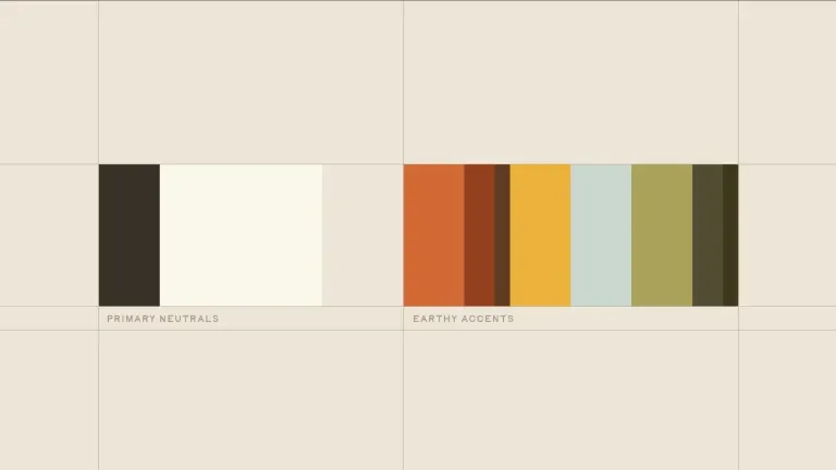
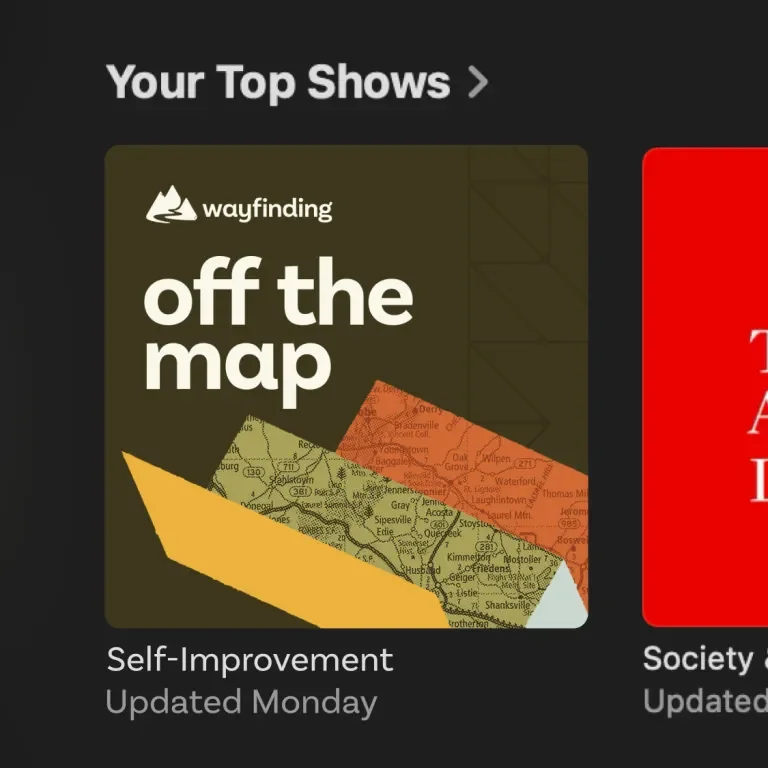
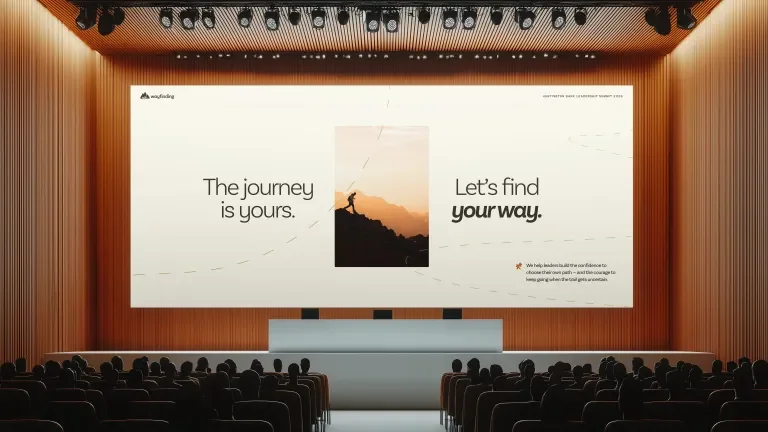
Dotted grids suggest movement without implying there's only one right direction. Hand-drawn details and texture keep things human. The color palette brings energy without losing the grounded confidence a good Guide brings into an exploratory experience.
Elevated and sharp? Hell yes.
Corporate, abstract, and stuffy? Hit the road, Jack.
The Vision Was There. We Gave It a System.
Strategy, voice, and visuals stopped operating like separate things and started working as one system.
That started with brand architecture. Wayfinding offers a lot of ways in: one-on-one coaching, leadership team experiences, wilderness retreats, community events, and self-guided resources. We mapped how each one ladders back to the larger brand, so every offering can have its own personality while still feeling grounded in the Wayfinding ethos.
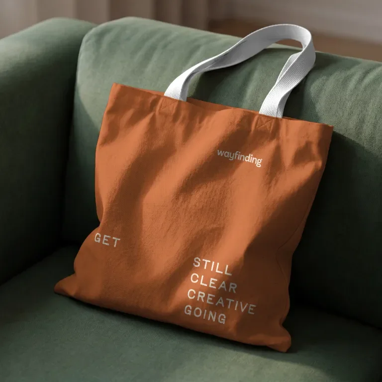
And because the Wayfinding experience is deeply personal, the language needed to reflect that, too. With experienced, enthusiastic, and deeply invested Guides meeting people wherever they are on their leadership journey, we helped bring clarity to how that support is communicated, making it easier for people to understand their options and find the right fit. Tying it all together is Wayfinding’s framework: Get Still. Get Clear. Get Creative. Get Going. A shared path that brings consistency to every program, session, and resource, no matter where someone begins.
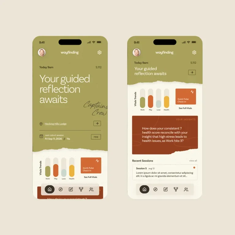
That same thinking carries through the visual identity. The path, the W mark, and the dotted grids create a flexible visual language that feels just as natural for a wilderness retreat as it does for a leadership workshop or self-guided workbook. We extended that system across Wayfinding’s website and brand materials, creating a recognizable, connected experience at every touchpoint.
And the real value goes beyond how the brand looks and sounds today. New programs don’t have to start from scratch. The team has a clear foundation for deciding that comes next, and how to keep growing without losing what makes Wayfinding, Wayfinding.
Turns out (personal) alignment is pretty useful for brands, too.
A Clearer Brand.
A Truer Reflection.
We didn't turn Wayfinding into something new. We made sure it looked and sounded like itself. The work gave Wayfinding a clearer strategy, a more recognizable voice, and a visual identity with enough range to grow alongside the business. But one of the most meaningful parts of the process was simply reflecting the work back to the people who built it.
Wayfinding spends its days helping people recognize what they're capable of. Through this process, we got to return the favor. The warmth matters. The clarity matters. The joy matters. The way people feel seen matters. That isn't extra personality layered onto Wayfinding. That is Wayfinding. Now the brand reflects it. And there's plenty of road ahead.