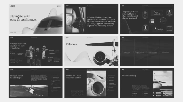
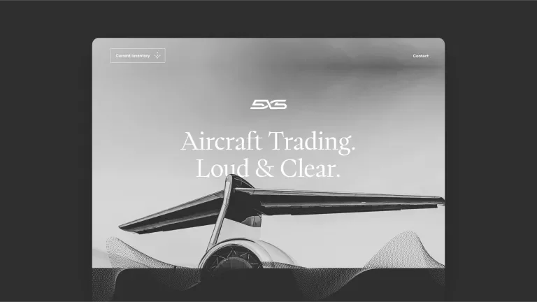
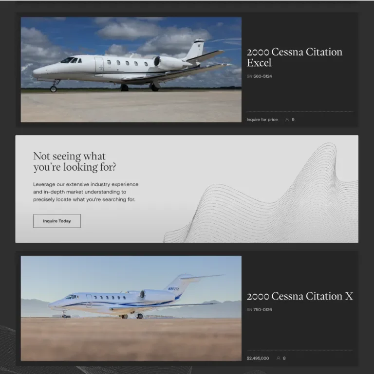
5x5 Trading is the newest player in the private aviation industry. Their founders are no strangers to startups, having built and led the industry's top-performing business aviation brokerages over the past two decades. As an IADA-accredited broker and dealer, 5x5 has already established itself as a trusted partner in the industry. We are proud to have been chosen by them to bring their vision to life and introduce the world to the 5x5 brand.
The Name
In voice communication over two-way radios, a transmitting station may ask for a report on the signal they are broadcasting. The term "five-by-five" is used to indicate that a signal has excellent strength (5) and clarity (5). It is commonly used in aviation to ensure that all parties are operating on the best wavelength. At 5x5 Trading, delivering clarity and confidence are at the core of everything they offer, making the name a fitting choice.
Execution
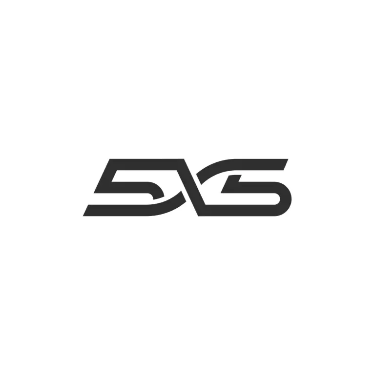
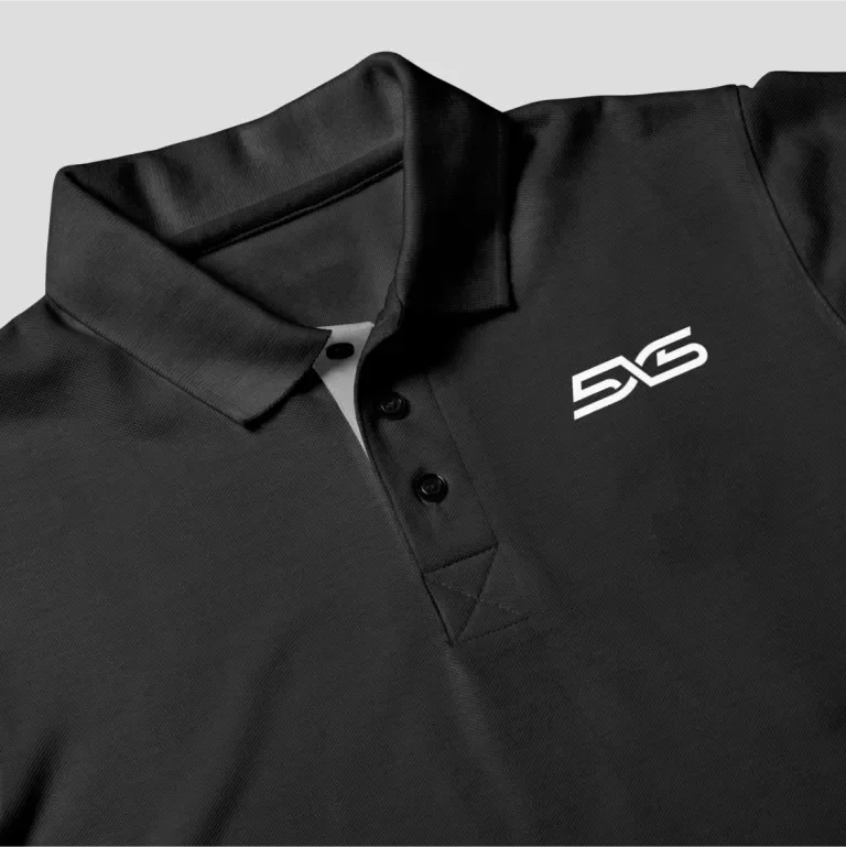
Beginning with the 5x5 logomark, we feature a custom-type solution that embodies the essence of 5x5. The X serves as the catalyst of unparalleled signal and strength, which flows throughout the composition, The deliberate use of a forward angle serves as a visual testament to the founders' innovative spirit, suggesting a constant push towards progress and advancement.
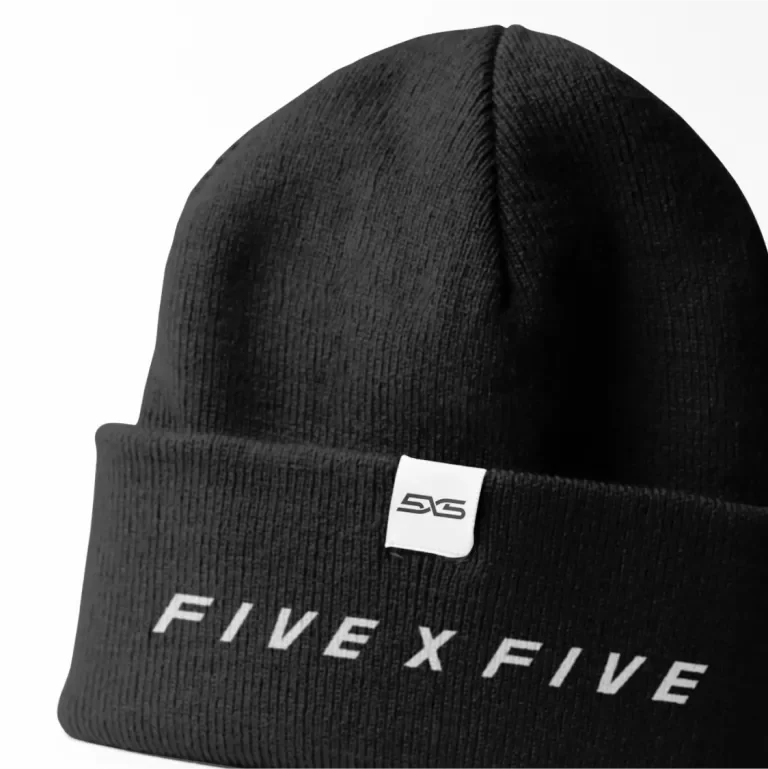
The wordmark serves as a secondary element to the primary logomark and is used strategically to fit spaces and compositions not best suited for the primary logomark.
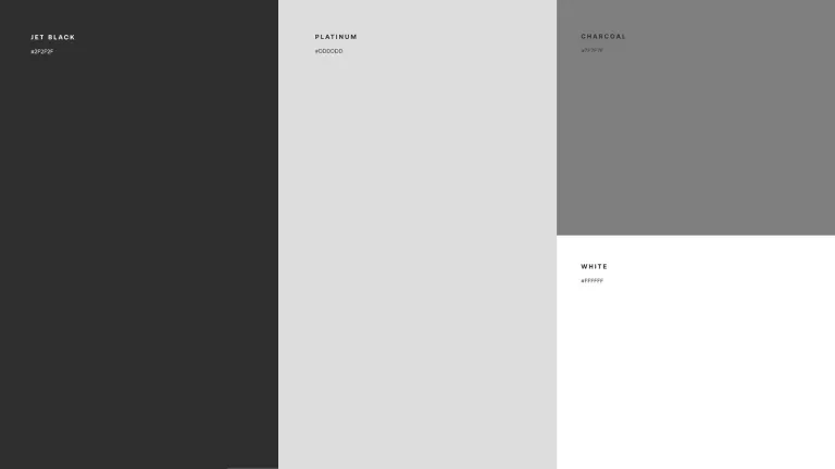
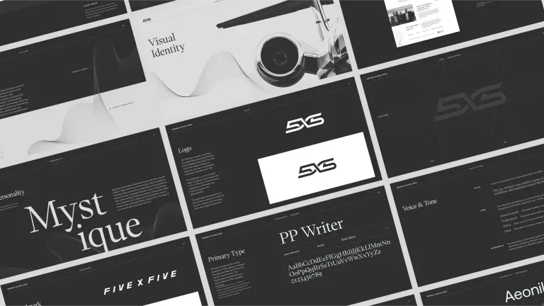
The 5X5 brand places a significant emphasis on the color palette, predominantly featuring Jet Black with strategic accents of Platinum. This choice imparts a sleek and elevated feel, standing apart from the crowded marketplace of dealer brokerages.
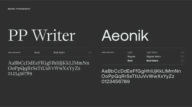
The brand language uses two dominant typefaces that pair together for a distinct, upscale execution across all marketing channels. PP Writer is used as the primary headline font, while Aeonik is used as the secondary compliment.
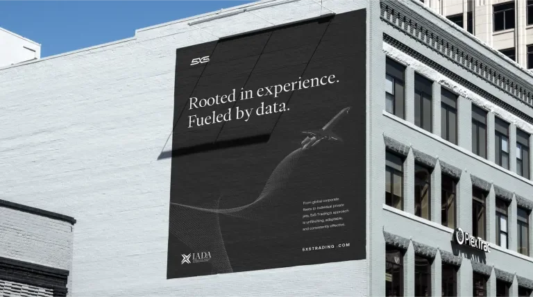
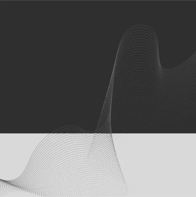
Inspired by the signal that 5X5 represents, the pattern design encapsulates multiple layers of meaning. The organic shapes within the pattern embody adaptive problem-solving, reflecting the brand's dynamic and flexible approach. The strategic arrangement of dots transitioning from proximity to expansiveness conveys the action of clarity and constant optimization of signal strength. This integration enriches the visual identity of 5X5, adding depth and resonance to its representation.
Technology
