Same soul. More spark. A 4-week brand evolution that carried a much-loved identity into an entirely new chapter.
Boundless is a nonprofit dedicated to building a world that realizes the boundless potential of all people. For years, they've shown up for their communities with a brand people genuinely love — an identity as warm and human as the mission behind it. So when Boundless was acquired by their new parent company, Merakey, the question wasn't whether to change. It was how to evolve gracefully: how to honor everything that already worked, step confidently into a new family, and set a foundation strong enough to carry the organization forward.
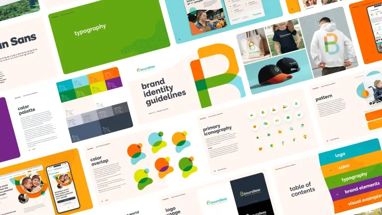
Over a focused 4-week sprint, Bonfire Red reworked the logo, evolved the color and type systems, codified the brand's voice, and delivered a complete toolbox designed to keep every future touchpoint cohesive.
Evolution, Not Revolution
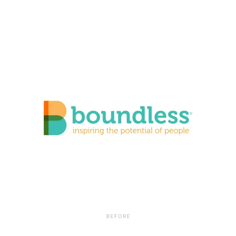
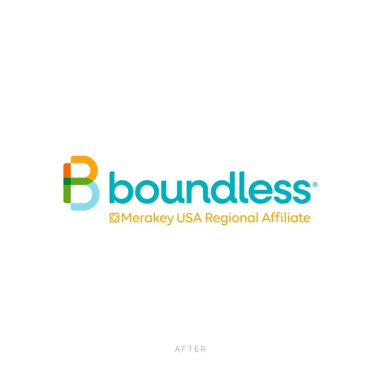
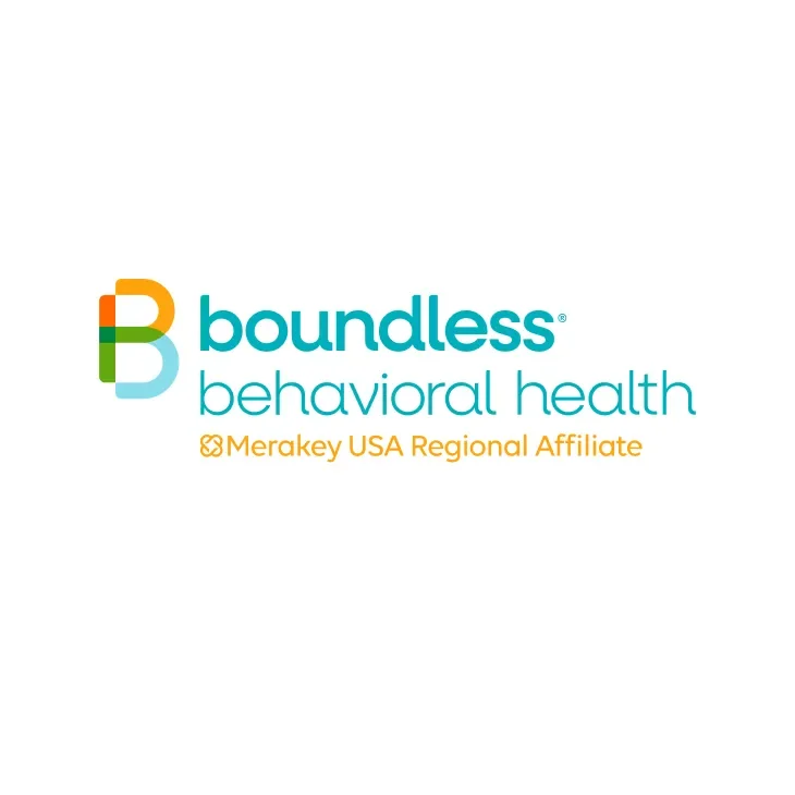
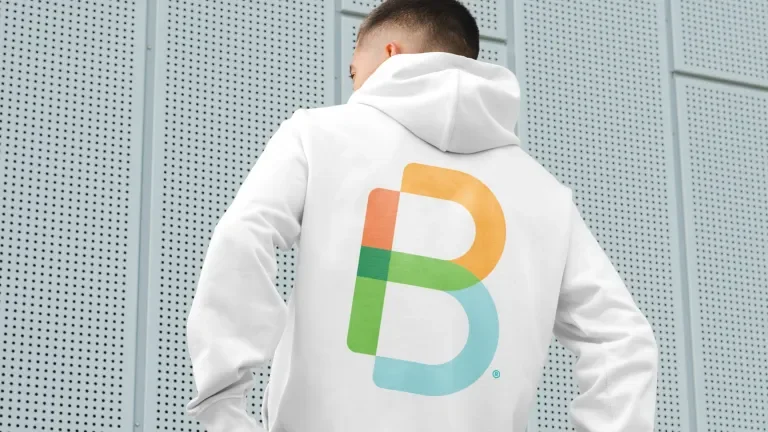
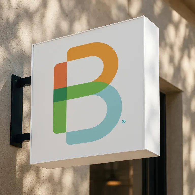
The heart of the project was the Empowered B. We explored bold, revolutionary directions — but the smartest move was restraint. The Boundless' team and people they serve have a real affection for this mark, and that loyalty is an asset, not an obstacle.
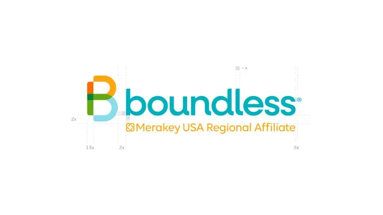
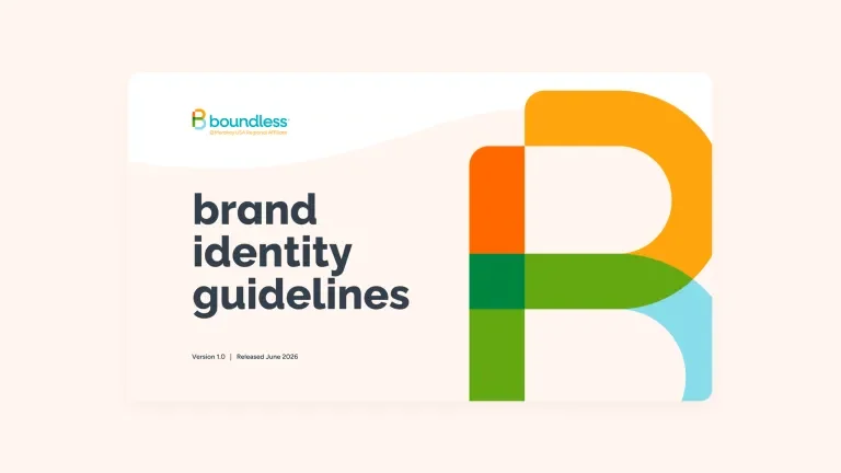
So we evolved it. We kept the overlapping construction that gives the B its depth and its rich, layered color. We preserved the legacy letterforms built into the mark — an I, a D, and a D — quietly carrying the brand's history forward. Then we opened the whole thing up and softened its corners, inspired by the openness of the Merakey mark, to make Boundless feel friendlier, more modern, and unmistakably part of a family.
A Palette With More Spark
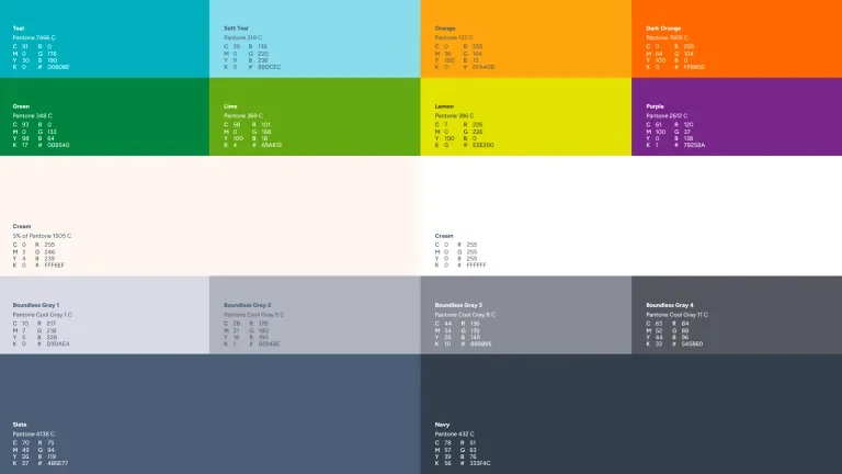
Placed side by side, Boundless's original colors read a touch muted next to Merakey's brighter, more vibrant palette. Our job was to close that gap without erasing Boundless's identity.
We evolved the palette to be brighter and more energetic — enough to feel at home beside the parent brand while keeping the recognition Boundless's patients and employees rely on. Some colors married effortlessly; the greens practically overlapped from the start. We brought navy back in a bigger way, warmed the system with a signature cream, and gave the neutrals new life. For the sub-brands — Boundless Health, Boundless Foundation, and Boundless Behavioral Health — we built a clear hierarchy, holding Behavioral Health's established grayish-blue as a deliberate legacy nod.
A Type System the Whole Organization Can Use
Boundless opens its brand up across the entire organization — everyone, at every level, has access to everything. That single principle shaped the typography: whatever we chose had to be easy for anyone to install company-wide.
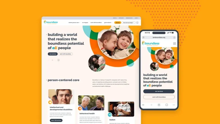
After a deep exploration, the answer led us right back to a face Boundless already used on its website — Raleway, chosen as the primary for its friendly, characterful details (a rounded l, a single-story a we swapped in, and alternates for the capital G, lowercase q, and W). We paired it with Figtree, a friendly, geometric, utilitarian secondary that felt right straight out of the box. And when a late-stage idea from the client's world proposed a third face for emphasis, we made Alan Sans earn its place — reserved for headlines and big statistics, used sparingly for maximum impact. Every font is a Google Font, accessible to the entire team.
Language That Leads With Respect
A brand is how it sounds as much as how it looks. Much of the Boundless' voice lived in the heads of the people who write for it every day — so we helped put it on paper. Our copy team built clear guidelines covering punctuation, mechanics, how to describe the organization within the Merakey context, and — most importantly — how to write about the people Boundless serves.
That meant intentional, respectful choices: capitalizing "Deaf," favoring "people with disabilities" over dated or diminishing phrasing, and recognizing that this language evolves over time. The guide closes with the most important rule of all: when in doubt, ask. Standards give you a foundation; genuine respect means meeting every person the way they wish to be met.
A Toolbox, Not Just a Guide
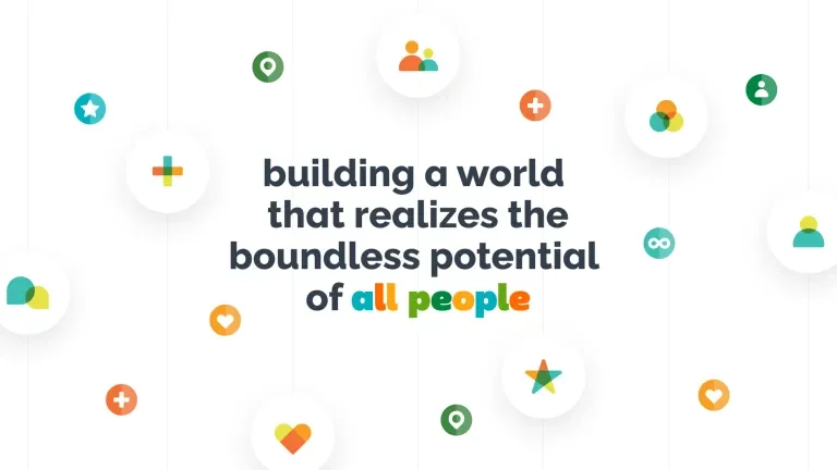
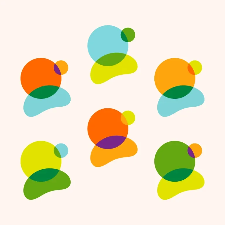
Great brands don't just get a rulebook; they get the tools to build with. We delivered Boundless a full toolbox — standardized icons (some finally handed over after being created during our earlier website work), plus a consistent kit of shapes, patterns, and layout rules.
Because the Boundless team creates so much of its own material, cohesion was everything. Instead of curves and graphics wandering wherever they liked, the team now has a defined set of pieces that keep every asset cohesive and on-brand.
Alive at Every Touchpoint
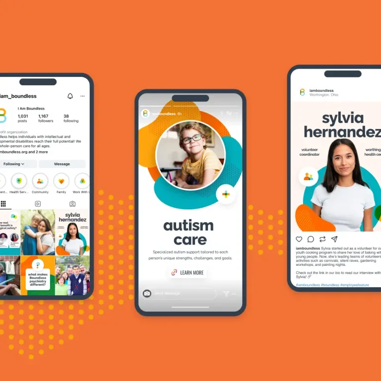
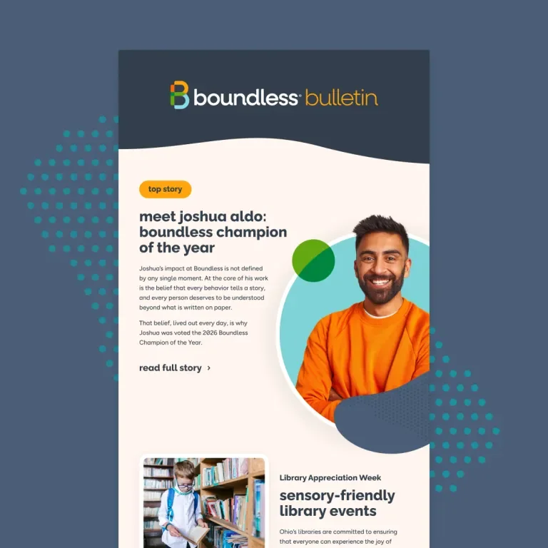
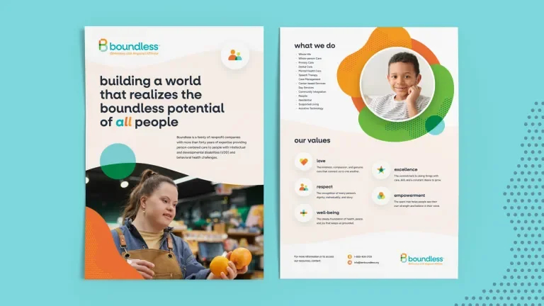
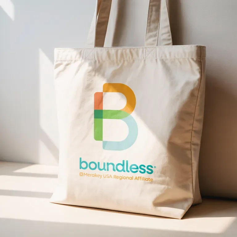
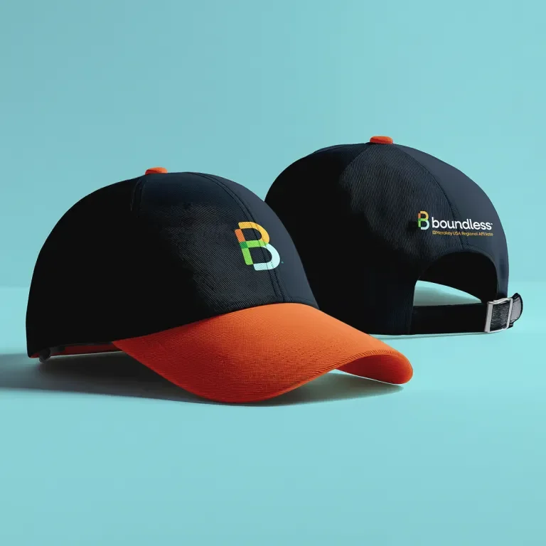
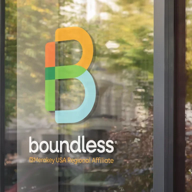
We put the system to work across real applications so Boundless could see it breathe — apparel (including a navy-and-orange hat we're a little obsessed with), signage that shows off the sub-brands, flyers reworked to feel bright and organized rather than crammed, company-wide email layouts, social posts, and icon-driven highlight covers. Wherever information runs dense, we showed the team how to let a layout breathe without losing a single detail.
Why 4 Weeks Worked
A brand evolution this complete, this fast, doesn't happen by accident. It happened because of how the work was run: twice-weekly client check-ins, a disciplined 24-hour feedback loop, and a client team that stayed fully engaged on every single call — even while navigating everything else an acquisition brings. Add a foundation we already understood from years of prior work, a strategy that didn't need reinventing, and a Bonfire Red team passing work fluidly back and forth, and the momentum simply never stopped.
The result is a brand that feels both instantly familiar and genuinely new — one of the most complete, ownable identities we've had the privilege to build. Boundless steps into its next chapter recognizable to everyone who already loves it, and ready for everything ahead.
Same mission. New chapter.
Visit
Website
Technology