The study of language is bigger than vocabulary. It’s connection, culture, identity, curiosity, and the ability to see the world through someone else’s perspective. The Ohio State University College of Arts & Sciences wanted to bring that idea to life through Love of Languages — a new initiative designed to create excitement around language study and give students, faculty, alumni, and the broader university community something to rally around.
The inaugural Love of Languages 5K would be the identity’s first moment in the world, but the opportunity went beyond a single event. Bonfire Red created a flexible visual system designed to feel distinctly Ohio State while giving the initiative enough energy and personality to grow over time.
SO, WHAT DOES LANGUAGE LOOK LIKE?
We began by considering what language does — how it connects people, creates expression, builds understanding, and sparks conversation.
That thinking led to several distinct creative territories, each built around a different interpretation of “Language as…” — from connection and movement to expression and form. Ultimately, Language as Conversation rose to the top for its vibrant, energetic, and distinctly human feel. It gave the initiative an expressive idea broad enough to represent many languages, cultures, and experiences.
PUNCTUATED WITH PERSONALITY
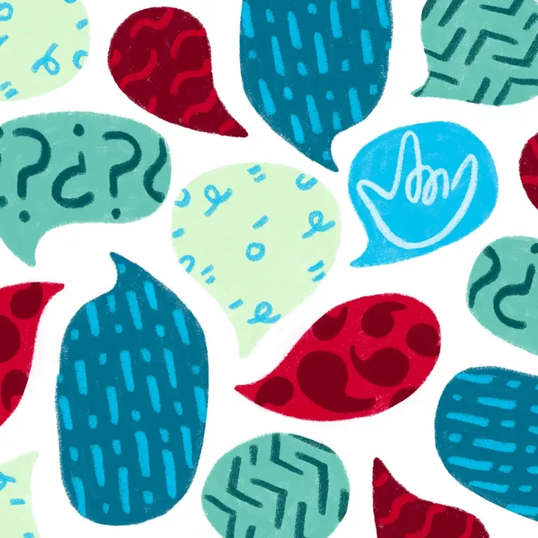
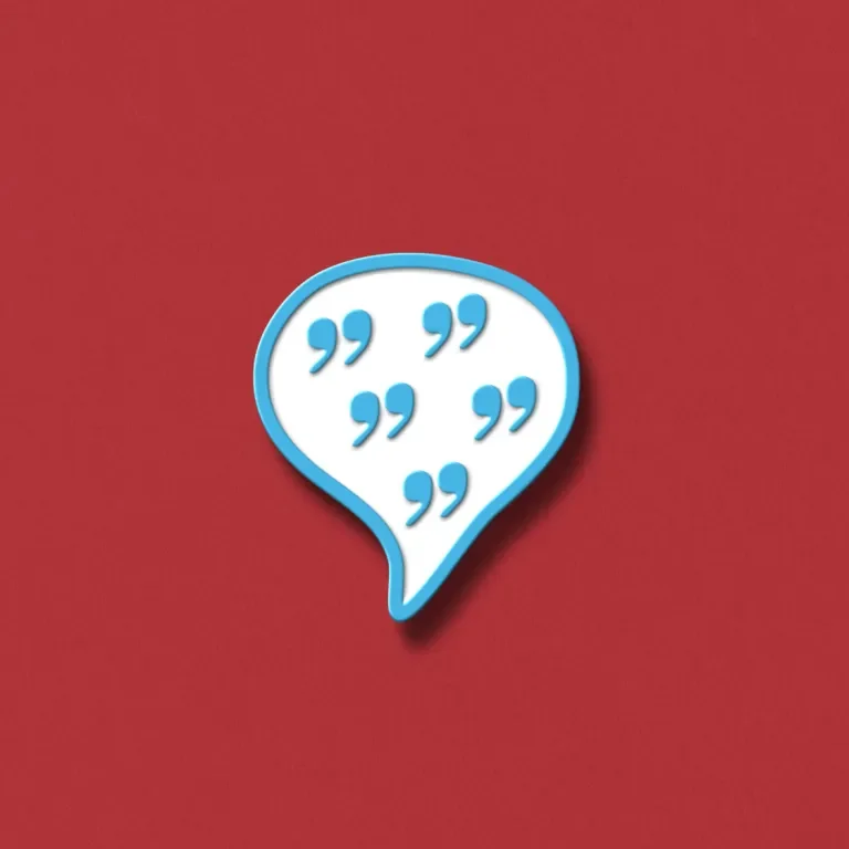
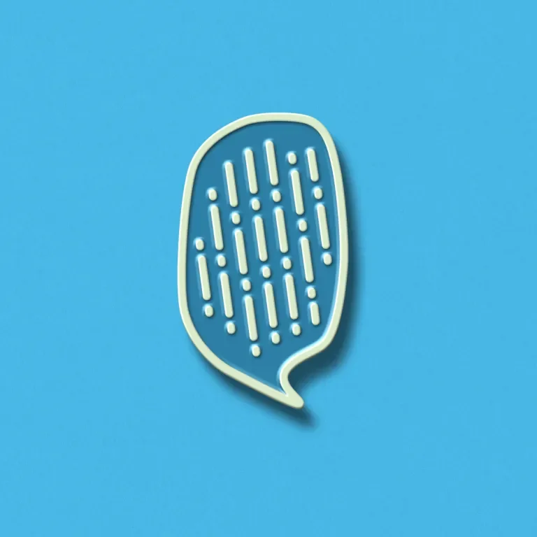
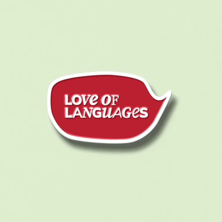
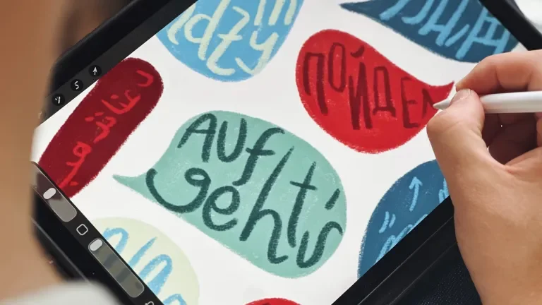
Speech bubbles became the primary graphic device, filled with playful patterns made from punctuation marks. The result feels instantly communicative without belonging to any one language.
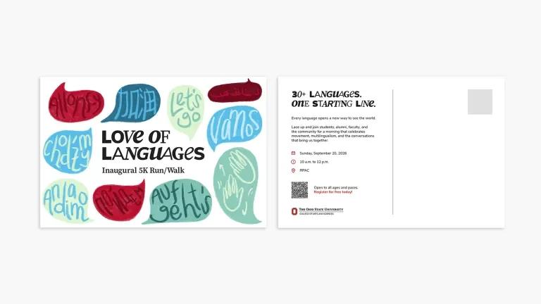
Commas, question marks, diacritical marks, exclamation points, and ASL hand gestures become texture, movement, and personality. Layered inside speech bubbles and across layouts, the hand-crafted patterns create a flexible system that can shift in scale and energy across everything from apparel and postcards to banners and social content.
OHIO STATE, BUT WITH MORE RANGE
The identity needed to feel fresh without feeling disconnected from Ohio State, so we looked deeper into the university’s existing brand toolkit.
A dynamic mix of Buckeye Sans and Buckeye Serif gives the typography personality while keeping it firmly rooted in the master brand. We paired it with a fresh look at Ohio State’s extended secondary color palette, using brighter supporting hues to bring more energy and range to the system while keeping Scarlet as an important anchor.
A PERSONAL TOUCH
Language is deeply human, so we wanted the graphic system to feel human too.
Key speech bubbles and punctuation patterns were drawn by hand in Procreate using a textured pencil brush. Slight variations in line, spacing, and shape keep the artwork from feeling overly institutional and give the system a warmth that complements its playful character.
We also documented how the artwork was created, giving the College of Arts & Sciences team a simple way to extend the visual language while preserving its look and feel.
ONE EVENT, A MUCH BIGGER CONVERSATION
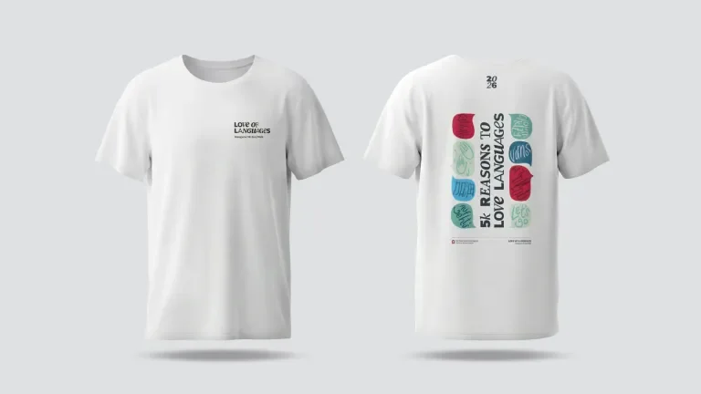
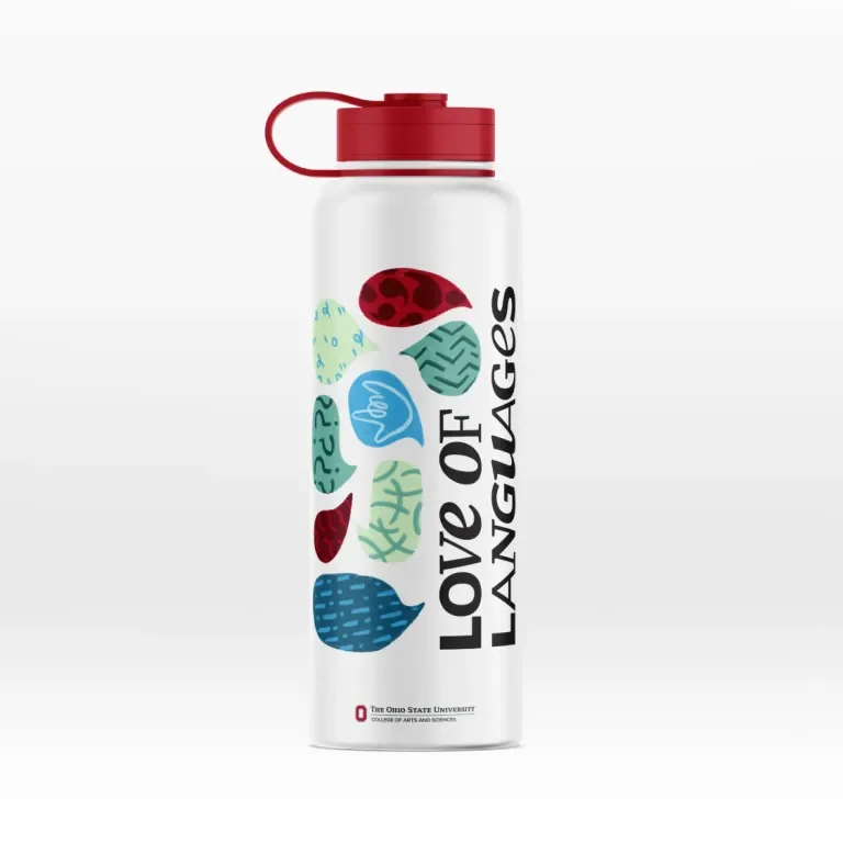
The inaugural 5K gave the identity its first real-world test. We applied the system across touchpoints — shifting scale, color, typography, and pattern to create variety without losing cohesion.
That flexibility allows Love of Languages to live beyond race day, with a visual toolkit built to support future communications, programming, and experiences across the College.
YOU GET THE PICTURE
Love of Languages gives the College of Arts & Sciences a way to talk about language study that feels less academic and more alive — expressive without becoming childish, globally minded without leaning on cultural clichés, and unmistakably Ohio State without simply repeating the university’s core brand.
At its heart, the identity is built around the same thing language itself is built around: individual parts coming together to create something more meaningful.
Different marks. Different voices. One shared conversation.