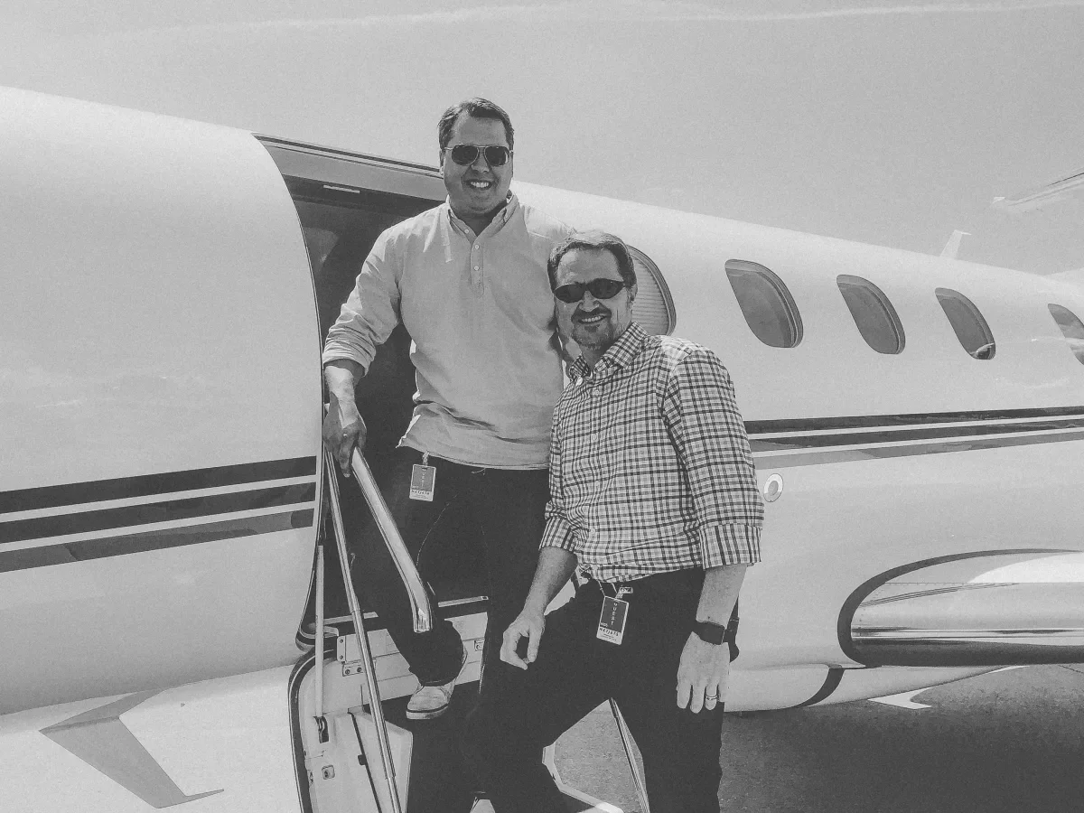
Why am I so fired up about aviation? Twenty years in, and I'm still counting the days until I head to the desert to swap stories with the best in the business at NBAA-BACE this October.
Because aviation is where I cut my teeth in UX/UI design.
Thrown in feet first
My first aviation project landed in 2005, when I was a Senior Designer at Resource Interactive: the online booking experience for NetJets. Not a digital brochure. A real application, built for the most demanding clientele in travel.
It was a master's degree in human factors, usability, and UX strategy. Business analysts documented every requirement. Strategists interviewed countless owners and their proxies to define the experience.
And we built it under constraints that sound like folklore now. Internet Explorer 6 ruled the market and our lives. Screens topped out at 1024x768. We designed inside a super limited web-safe color palette, and every page had to weigh in around 30–50K to beat the "3-second rule."
The best design I never showed
NetJets is the pinnacle of luxury, safety, and access. So I designed for luxury. Sheens, bevels, metallic textures. I blinged that thing up like nothing I'd ever made, and I was proud of it. My creative director wasn’t thrilled.
It never made it in front of the client.
All that texture made pages crawl, and mobile was going to be even worse. Turns out I'd misread the user. The person booking the flight usually wasn't the fractional jet owner. It was their executive assistant, who needed to book or change a flight in one click, with the app already knowing the snacks, drinks, music, and comforts the owner expected.
The bar was simple: if picking up the phone was easier, we'd failed. That lesson has shaped everything I've built since. In digital, luxury isn't decoration. It's how effortless the experience feels.
Full circle
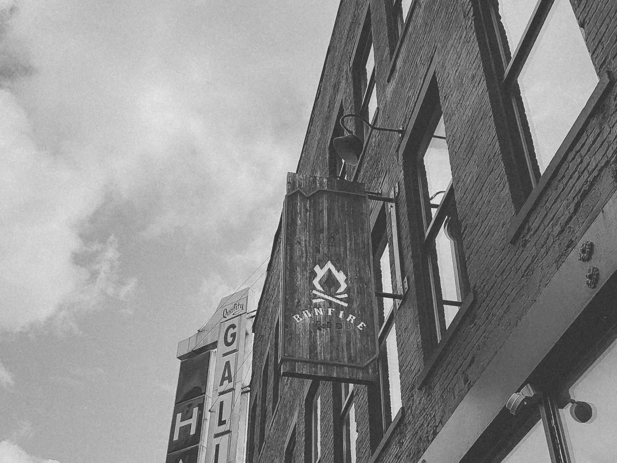
In 2016, I got a second shot at NetJets. This time under the Bonfire Red logo, redesigning their corporate website. I'd been working toward that moment for 11 years.
And the site needed it. NetJets delivered the most curated travel experience in the world. Its website said otherwise. If I ever need a textbook example of an alignment gap, this is specimen #1.
Prospects landed on a dense, clinical site with confusing navigation and a mobile bounce rate near 60%. So we started where we always do: discovery. Executive and sales interviews mapped the real purchase journey. We shifted the story from spec sheets to aspiration, and designed the site to act like a concierge, guiding ultra-high-net-worth prospects toward a conversation instead of a hard sell.
Then came the big problem. Photographing all of the different aircraft models was proving to be quite an expensive task. So we built 12 photorealistic 3D jets straight from the manufacturers' CAD files. Visitors could spin them 360°, explore cabins, and walk virtual floor plans right in the browser. That move saved NetJets hundreds of thousands of dollars in production and gave them an asset library for web, mobile, and print that is still in use to this very day.
Under the hood: a decoupled Angular and Drupal platform wired into Salesforce for lead capture and live flight mapping, letting NetJets' US and European teams run their own regional content in 7 languages. We built it in two-week sprints and handed it off with a CMS playbook so their team could run it on their own.
This redesign was a defining moment for Bonfire Red — and for me. In the decade this site has been live, the content has changed, and so has a lot of the technology. But you know what hasn't changed? The UX/UI. It's the same one we designed in 2016. That's saying something.
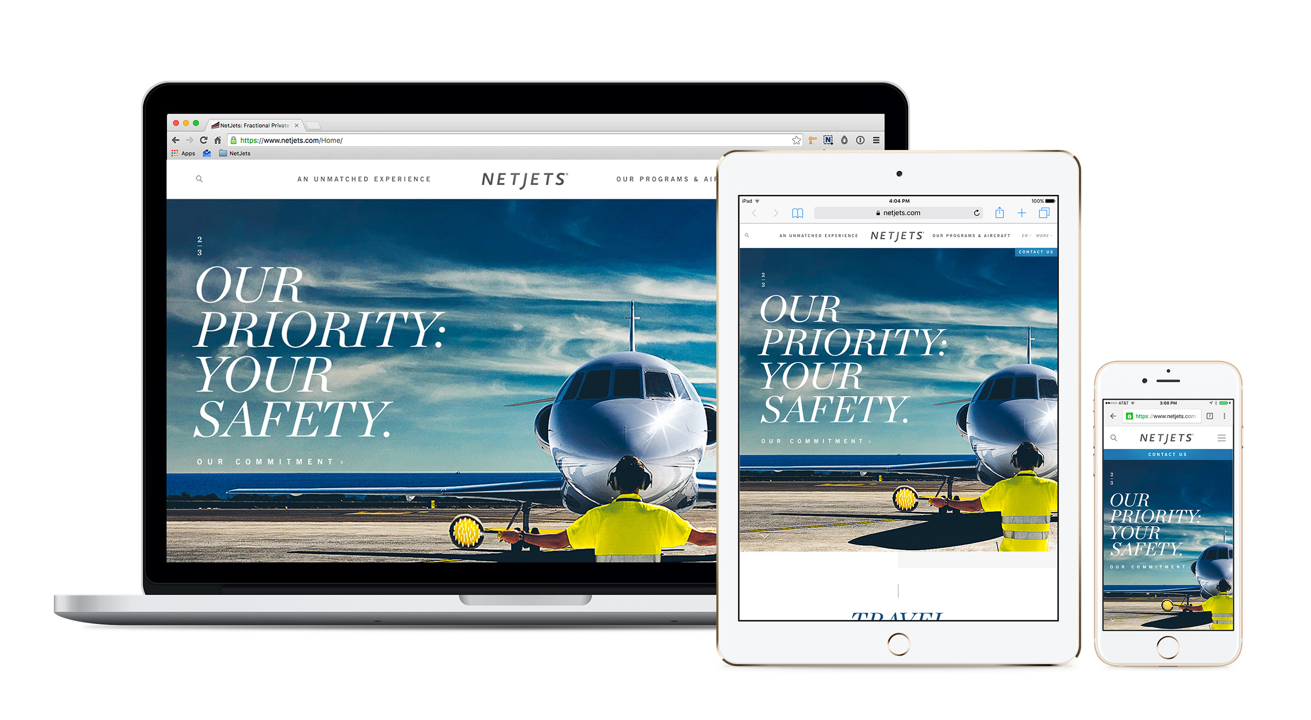
Aviation is in our DNA.
That redesign opened the door to partnerships across aviation, with brands small and large. Five brands and hundreds of deliverables later, here's what I'm proudest of: no two look or sound the same. They shouldn't.
We don't run an A-to-Z playbook. What happens in the middle is always custom, personal, and honest. That's where our most effective brand and digital work lives, and we're just getting started.
So if you're an aviation brand, or a brand in any industry, don't feed your story into an AI chatbot and call it done. If you want a brand built for you, not generated for you, reach out to Joey Zornes. I’ll tell you all about what we’ve done for others, and what we can do for you.
And if you’re reading this, and you’ll be at BACE in October — I’ll see you there.
Key takeaways
- Design for the real user, the right medium. At NetJets, the owner or the executive assistant needed speed and efficiency, not bling.
- In digital, luxury is effortless. If picking up the phone is easier than using your app, the UX/UI has failed.
- Great UX outlasts its technology. The NetJets site's content and tech have changed over a decade. The UX/UI we designed in 2016 hasn't.