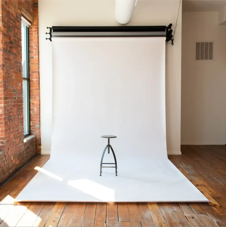
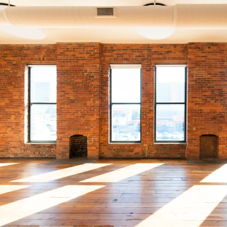
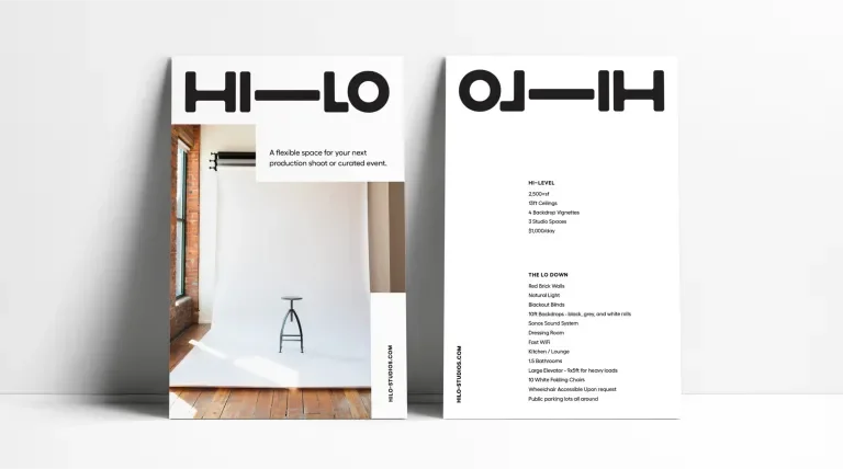
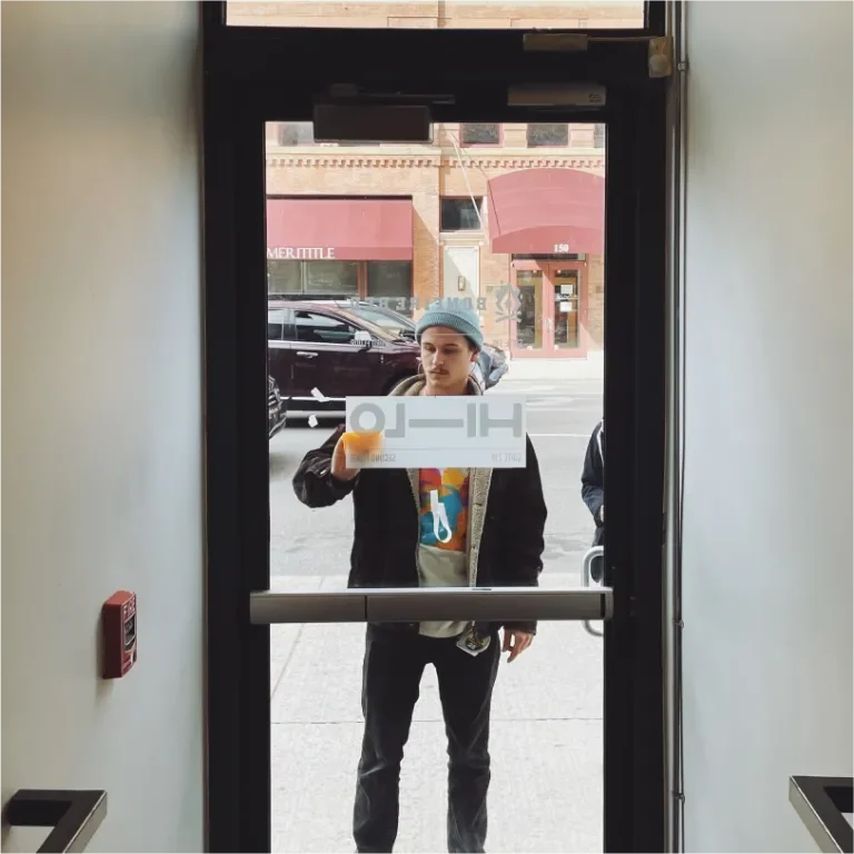
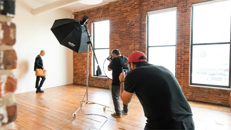
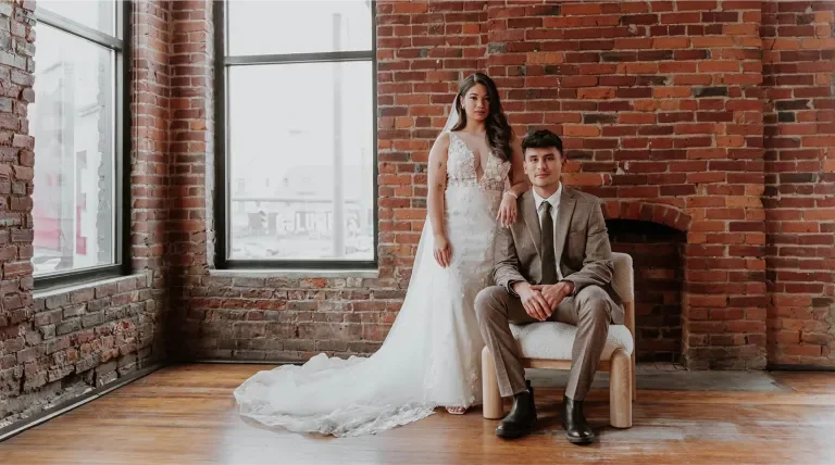
Hi-Lo is 2,500+sf of industrial space located in downtown Columbus, Ohio. Hi-Lo is an invitation for fellow makers to explore and outfit the space for any high or low-fidelity production or curated event.
VISUAL LANGUAGE
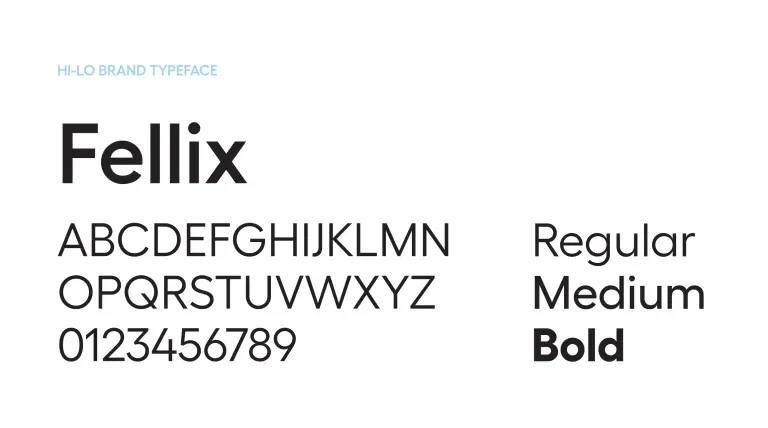
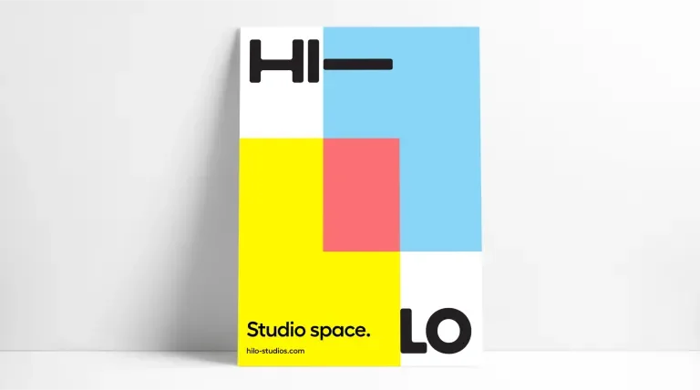
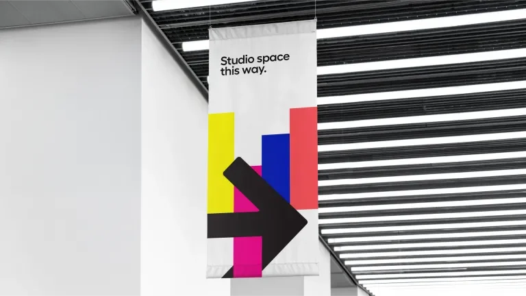
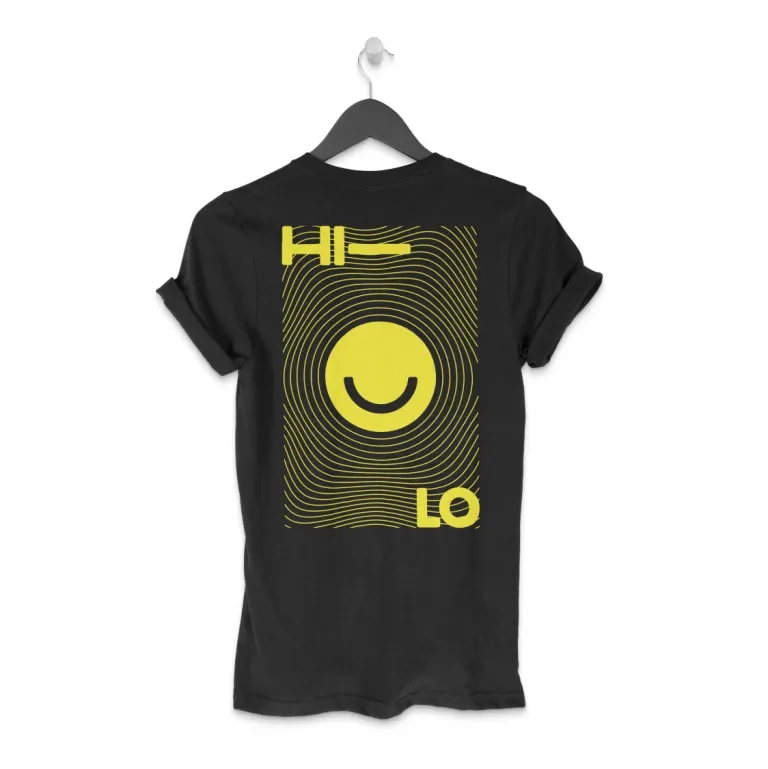
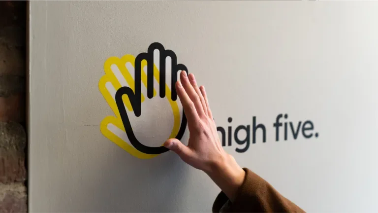
At its core, the Hi-Lo brand is simple and straightforward. It’s a clean, san serif logo complimented by a clear voice and tone. Scale out a bit more and it becomes surrounded by a personality both vibrant and fun. The space itself mirrors this idea, simple at its core but with a little creativity it can be outfitted to be much more.
LOGO TYPE
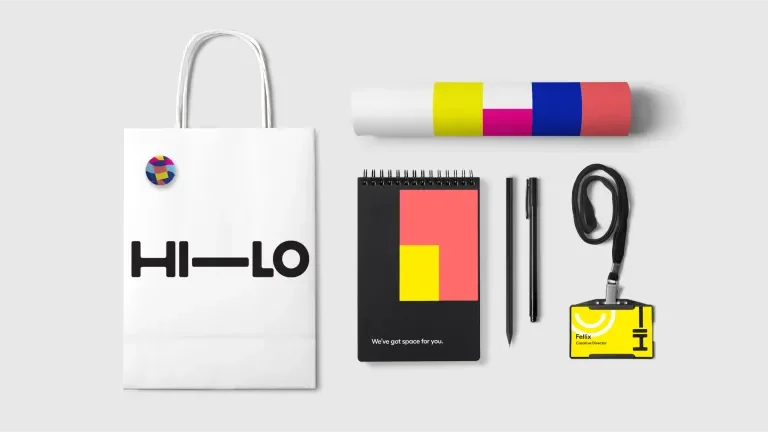
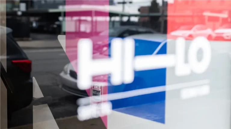
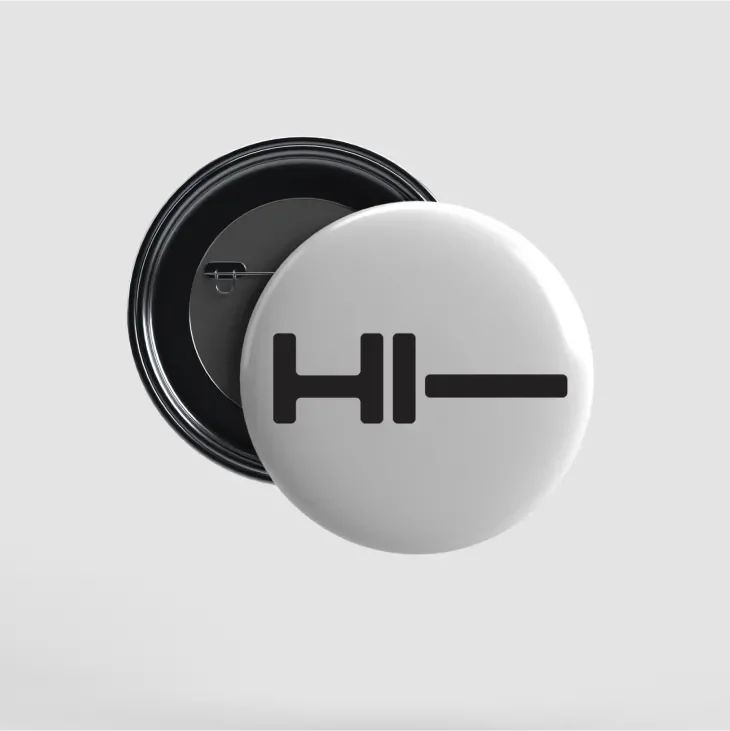
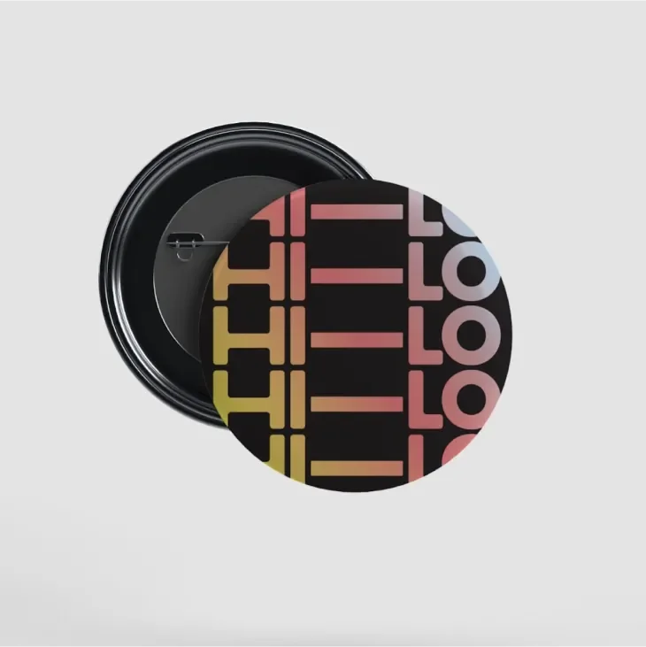
The logo is simple and modular like the studio space. Slightly curved custom letterforms sit tightly yet comfortably together. When applied, the logo boldly takes up space and naturally creates a 3-column grid system for the brand to live within.
VOICE & TONE
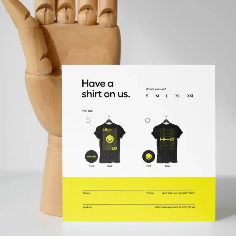
Clarity first and foremost. It’s more important to be direct than to use fluffy marketing jargon. Humor hits naturally and comes with a clever wink, it shouldn’t feel forced.
COLOR
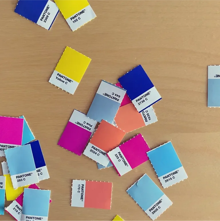
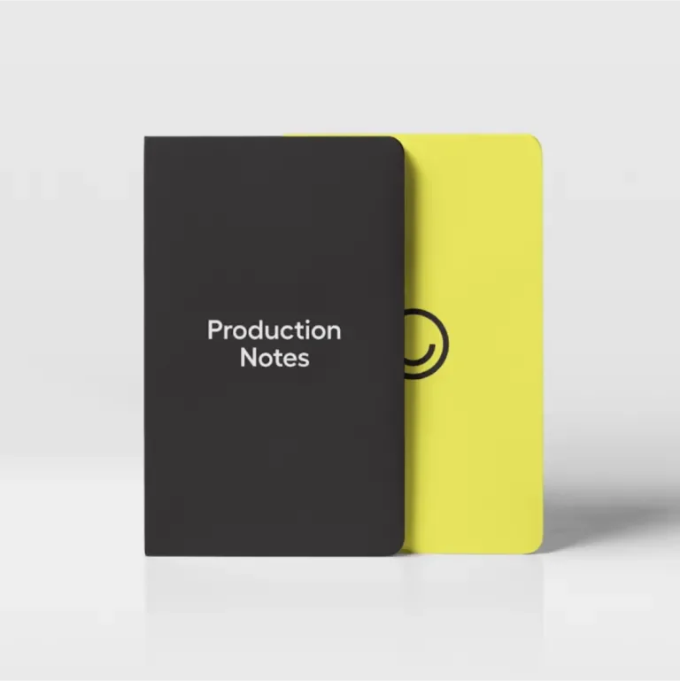
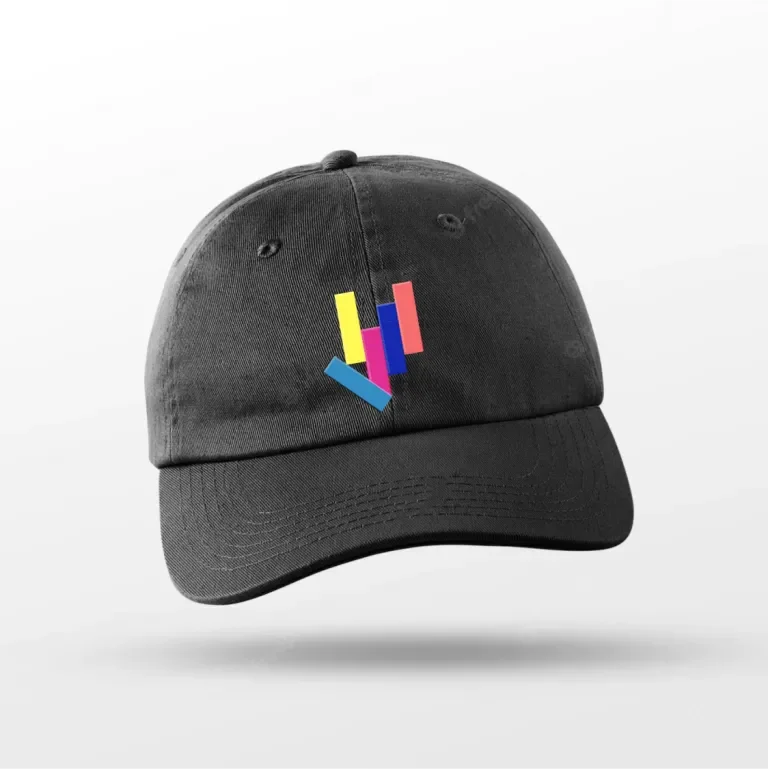
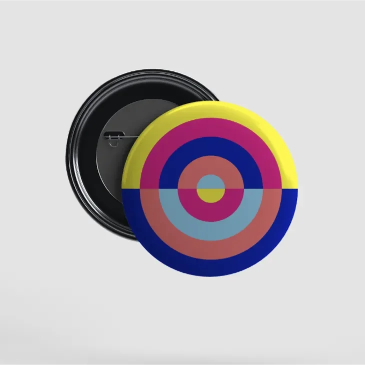
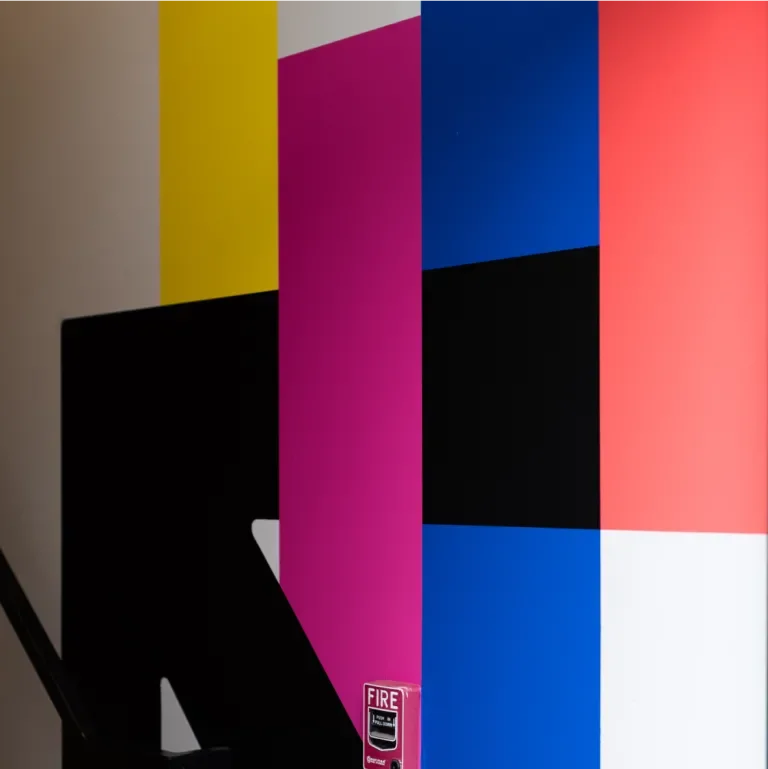
The Hi-Lo color palette is expressive and vibrant. The energetic yellow is dominantly applied, while the hot pink, cobalt, coral and light blue are used to add contrast, range and balance to the overall brand.
Visit
Website
